All images by Justin Tan for RICE Media unless stated otherwise.
In 2014, Samuel Lim, then a design communications student at LASALLE College of the Arts, noticed something odd on his daily commute.
As he stepped onto the Outram Park MRT station platform each morning, he would see harried commuters going up a particular escalator. Then they would come back down again, clearly lost.
“People would make a mistake at the exact spot. I saw it happen with tourists, the elderly, and even kids. Every demographic made the same mistake,” Samuel recalls.
“After a while, I realised maybe something’s wrong with the sign.”
It was this fleeting observation that would eventually land him a job at the Land Transport Authority (LTA), where he was tasked to redesign Singapore’s MRT station signage.
It would also set him on the path to becoming a professional wayfinder—someone who designs systems to help people navigate spaces. In other words, he’s the brain behind the directional signs you pass by every day without even thinking about it.
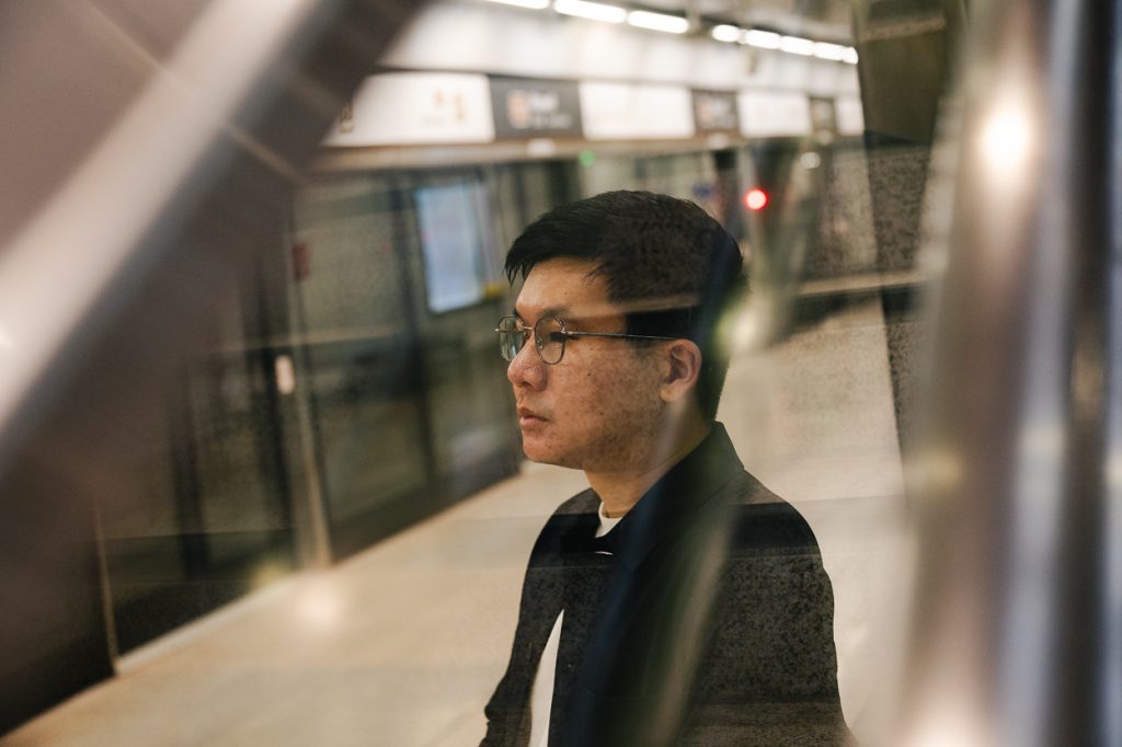
As we walk through present-day Outram Park MRT Station, an eagle-eyed Samuel points out the things he worked on before he left LTA in 2020.
He hasn’t had a reason to come back to the station in years, he confesses. But he glides through the space confidently, rattling off exit numbers off the top of his head. He somehow manages to notice how commuters are behaving, briefly pondering why an old man seems lost. All while giving me a rundown of all the changes he’s made to this station.
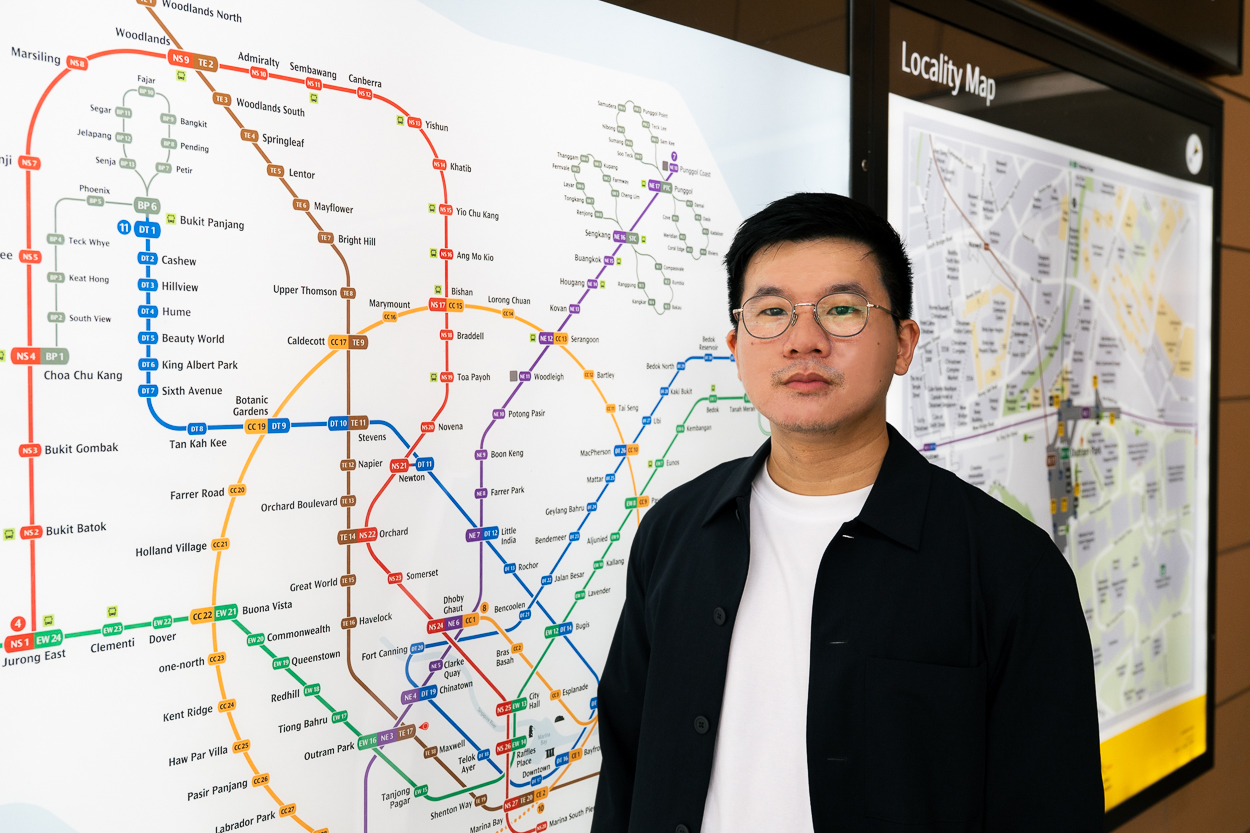
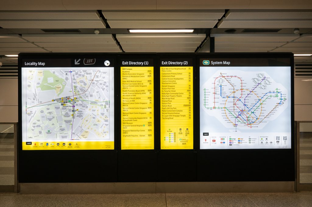
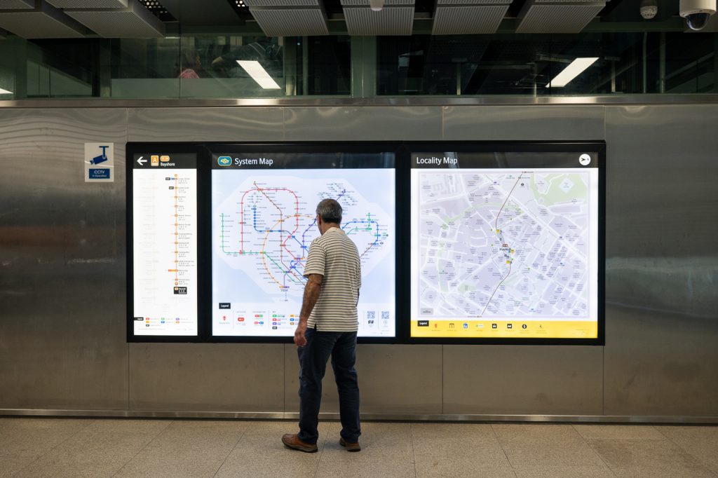
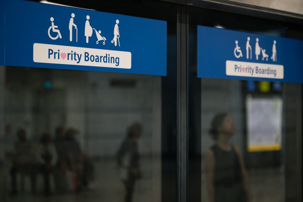
There’s the new MRT system map (thanks to Samuel and his ex-colleagues, the Circle Line finally looks like a circle), the directional signs throughout the station, the new numbered exits (instead of letters), the digital signs displaying train arrival times, and even updated graphics representing the station’s elevators and toilets.
I realise that Samuel, in a way, has been guiding my commutes to work. His redesign has been rolled out on all Thomson-East Coast Line (TEL) stations since 2020, and the RICE office happens to be right by Maxwell Station.
That’s the thing. For someone whose work is so visible and connected to our daily lives, his efforts are woefully underappreciated and unnoticed.
It’s a sad irony that the best navigation is the kind you never think about.
People only notice these signs when they fail to serve them, Samuel affirms. So why did he even embark on the thankless task of redesigning Singapore’s MRT signage?
Finding His Way Into Wayfinding
Samuel’s foray into wayfinding began with a simple objective: To convince people that design is important.
In secondary school, before he even knew what ‘graphic design’ was, he’d spend his free time sketching, redesigning logos he’d see around him. But by the time he moved on to LASALLE, he knew that there had to be more to design than simply making things look pretty.
“I realised that I couldn’t produce designs as nice as my classmates, or do the coolest, trendiest things. But I realised I can think as a designer,” the 34-year-old recalls.
“I realised I wanted to make design meaningful for people. I wanted to make the public talk about design and for them to appreciate design.”
Through informal surveys of the people around him, he found that even his closest friends weren’t aware that they interact with the language of design in their everyday lives.
“Literally, when you wake up, the moment you turn off the alarm on your phone, that’s design! Someone designed the button. Someone designed the experience of the alarm. Everything is designed,” Samuel enthuses. I feel like I’m the sole audience member at his TED talk.
“And it’s important that you demand better design. Because if the country doesn’t demand better design, bad designers can get away with low-quality stuff.”
His observations at Outram Park Station sparked a two-year research thesis and became the basis of his final year project at LASALLE, where he designed an entirely new MRT sign system.
“Someone influential” got a hold of the report and sent it to LTA, he says enigmatically, and the transport agency invited him for a chat in 2015. Unbeknownst to him, that ‘chat’ was actually a job interview.
Somehow, as a fresh graduate, he had landed the opportunity of a lifetime—the opportunity to overhaul LTA’s approach to wayfinding.
He set out to revamp the signage at Outram Park and Dhoby Ghaut, the two stations he deemed in dire need of fixing. Instead of a mere revamp, he was handed a far more daunting mission: to design the entire wayfinding system for the Thomson-East Coast Line.
“I asked for a cup of water. They gave me a whole jug,” Samuel quips.
From Student Project to Citywide Overhaul
From 2015 to 2020, Samuel and his team went through several rounds of design and testing. They carried out commuter surveys, made prototypes, and even made use of a soon-to-open MRT station as a test ground.
But Samuel quickly learned that just because a few higher-ups believed in his vision, it didn’t mean everything would go his way.
“Some people were like, ‘Why is this fresh grad trying to break everything?’” laughs Samuel.
“Because to fix the system, I needed to break the system, and that was really very hard.”
Designing a new system was the easy part; it came naturally to him. Getting the decision-makers on the same page as him was the true challenge.
“I literally was just always fighting…. well, ‘fighting’ is a strong word. But I will say this: I was always fighting for my case.”
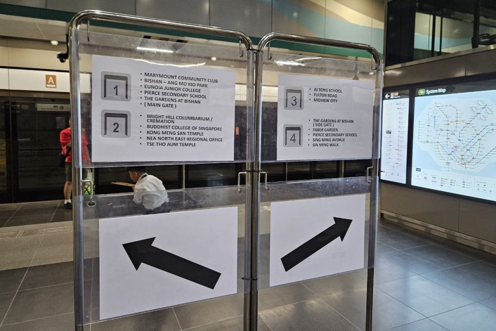
His first battle was to simplify the station signage. Over the years, MRT stations have taken to “spoonfeeding” commuters with information, Samuel explains. This resulted in wordy signs throughout the stations—bloated boards listing various landmarks nearby and their associated exits.
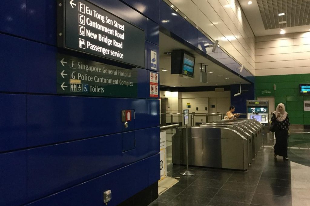
“So in Outram Park, it was crazy. We would have a signboard that was already packed. So we would add another piece below. How much can you grow? And at the same time, how long do you want people to stand there, staring at it?”
The problem with this approach is that there’s no clear logic or hierarchy, Samuel explains.
Say the landmark you’re looking for isn’t listed on the overhead sign. Do you know where to look for more information? Now imagine you’re a tourist. Or an elderly person who only speaks Hokkien.
What does lend itself well to expansion is a system with a clearer hierarchy. One where commuters are able to find their own answers.
“If I list five landmarks overhead, you’ll ask for six. But if I drop everything, you’ll think, ‘What the hell is this?’ Then you turn your head. It’s all there at the information point.”
Today, stations on the TEL follow this logic. Overhead signs provide directions to numbered exits at a glance. Information points tell commuters which exit they’re looking for.
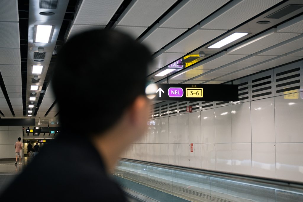
The numbered exits were another hard-fought battle. At the time, all MRT station exits were denoted by letters. When Samuel proposed a switch to numerals, the response he received was “Who doesn’t know ABC?”
But to him, using numbers was a no-brainer. They’re far easier to remember for people who don’t speak English, while conveying the complexity of a station in an instant.
“I cannot say ‘A to G’ and expect you to immediately know what’s in between. But if I say ‘1 to 10’, you immediately know what’s included. So, because of that, I can truncate the signs and make the content much bigger.”
It makes perfect sense. With numerals, commuters immediately know there’s a specific amount of exits to navigate.
“But if I tell you ‘A to G’, you won’t know how many exits there are—you’ll just know that it sounds like a lot.”
Battles Won, Battles Lost
There are battles, however, that Samuel has lost—one of which was his push for information points to be located on the TEL platforms. It still weighs on his mind.
“The decision starts at the platform. The moment you alight from the train is your first decision point, and for every decision point, you should be given answers,” Samuel says emphatically.
“I knew people needed information at the platform. If not, they will not know which side to choose. Unfortunately, I lost that battle, so the whole thing got taken out.”
Information points are places where people dwell, he explains. But transport designers typically want to get people off the platform as fast as they can for safety reasons.
It’s a reasonable concern. But at the same time, when it comes to effective wayfinding, you can’t pick and choose elements—it’s all or nothing. Every detail plays a part in guiding the journey.
It’s like cooking, Samuel offers. You can’t take out an ingredient and expect the dish to taste the same. It’s the equivalent of commenting “How do I make this without beans?” on a bean soup recipe, he adds with a laugh.
Samuel tells me bluntly that he knew that there would be unhappiness with the new sign system. But all he could do was hope that the wayfinding on the gantry level would suffice, and focus instead on the improvements he could make.
True enough, when the new MRT signs were rolled out in 2020, some frustrated commuters bemoaned the lack of information signs at the platform level.
“While the previous sign does not list [every landmark] in the exit, the few that are listed are more than enough to help with navigation,” one online comment reads.
“We also have to thank this Samuel Lim for pushing the oversimplification of our signage,” another added scathingly.
A Different Path
Samuel has since moved on to other things. After seeing through the redesign project, he left LTA in September 2020. A brief stint in user experience design within the Public Service Division followed, but it didn’t take long for him to realise that his true passion still lay in wayfinding.
Just as he was standing at a career crossroads, a LinkedIn message arrived, offering him an opportunity in Qatar.
“At first, I thought it was a scam,” he laughs. It was, however, a real job opportunity with Qatar Rail.
For two years, he lent his expertise to Qatar’s metro and tram systems, refining their wayfinding and mapping. But Singapore was always home. Upon his return, he founded Studio Lucidus, a consultancy that collaborates with developers and designers to take the guesswork out of wayfinding.
Through his studio, he wants to help local businesses, from hospitals to malls, improve their wayfinding. Still, in Singapore at least, his name is still indelibly associated with the MRT signage redesign.
His friends still send him snapshots of his work, which he deeply appreciates. Yet, his true measure of success lies with the masses. At MRT stations, he watches, ever so keenly, to see if commuters are finding their way around with ease.
And if you’ve ever grumbled about the new signs online, rest assured—Samuel has seen it.
To be simultaneously proven right by the complaints and criticised for a design flaw that you fought against? It’s not an enviable position to be in.
But some distance (literally) from his work has helped.
“After Qatar, I realised, you are not your work. Yes, people can criticise the sign, but they are not criticising me,” he reflects.
“I think that was something that took me so long to learn—to really detach myself from the work.”
When the TEL signage first launched in 2020, it didn’t exactly feel like a celebration. All he felt was relief (he was finally done with the battles) and anxiety (he didn’t know if public complaints would sink his redesign project).
Looking back, Samuel is keenly aware that the redesign had its triumphs—but also its missteps. Even now, he finds himself snapping photos of MRT signs on his daily commute, quietly cataloguing what still needs fixing.
Still, he’s found satisfaction in the work he and his team did: “I think we did something quite special.”
Such is the life of a wayfinder—or any creative, really. The act of creating is the easy part, the joyful part. The real battle lies in proving its worth, in convincing others that it matters.
But perhaps the hardest part of all is learning to celebrate your own work, even when no one else is looking.
“Good design is ultimately about positive impact—improving lives, enhancing experiences, and solving problems,” says Dawn Lim, the executive director of DesignSingapore Council (DSG), the national agency that promotes design. “Paradoxically, its greatest success often makes it invisible. When design is seamless, it fades into the background, making interactions effortless and intuitive.”
Unfortunately, it also means that designers like Samuel rarely hear from the people whose lives they’ve touched.
Design writer and founder of editorial studio In Plain Words, Justin Zhuang, tells me that no design is made in a vacuum. As much as designers would probably love free rein over their work, it’s important to understand how the design fits within larger contexts, be it economic, legal, social or even political.
“At the same time, it does not mean catering to the whims and fancies of the decision makers. A designer is, after all, a professional with specialist knowledge.”
The way to convince people that design matters, Justin says, is to point out how so many things around us are designed.
“And by extension, why are things designed the way they are? That opens up a whole conversation about how else the world around us can be designed—and how you can help shape it.”
“The most powerful way to convince others of design’s importance is through experience,” Dawn adds, citing Enabling Village, a community space designed with universal accessibility in mind.
“When people feel the difference that thoughtful design makes—whether it’s a smoother workflow, a more engaging product, or a more inclusive space—they won’t need persuasion. They’ll simply get it.”
That’s why DSG’s work includes cultivating design literacy, Dawn says. The more people recognise the impact of design on daily life, the greater the demand for thoughtful, well-executed spaces.
Samuel is on the same page. These days, the complaints about the MRT signage redesign don’t even bother him anymore, he tells me. In fact, it’s good that people point out areas that aren’t working for them.
“I always look at Hong Kong, Thailand and Japan—people who demand good design. And I’m hoping that Singaporeans will become very sensitive to that, so you cannot get away with bad design.”
A Wayfinder’s Best Work is Unseen
Samuel’s words are still fresh in my mind when I step out onto the Bright Hill Station platform on my way home.
Right in the middle of the platform are makeshift information points, listing the exits and corresponding landmarks. I snap a picture and send it to him.
Samuel is slightly incredulous. He responds with a “Wow” before launching into a series of texts describing why the makeshift sign has its hierarchy all wrong.
Had he gotten his way from the beginning, he would have placed a proper information point right at that very spot. And there’s a touch of vindication in it all—he was right about train station platforms needing those very points of clarity.
But beyond the numbers, colours, and information boards, Samuel’s journey serves as a vital reminder to creatives: trust yourself. Even when your work is deemed non-essential. Even when the very people you’re designing for fail to recognise your worth. Even when impostor syndrome threatens to creep in.
Because for Samuel, the signs he created didn’t just guide commuters to find their way. They guided him back to believing in the power of his own direction.