All images by Zachary Tang unless otherwise stated.
Clutter was given a bad name (and still does) when Marie Kondo’s hallowed cleaning method swept the homes by storm. You know, the one where people got rid of truckloads of their possessions that no longer ‘sparked joy’. Well, not anymore.
In one corner of TikTok, with 79.2 million views and counting, we meet #Cluttercore. She’s maximalism’s louder and more unabashed cousin where exhibiting all your possessions loudly and proudly is the name of the game.
ADVERTISEMENT
Here in Singapore, where interior design aesthetics such as minimalism, Scandinavian, Japandi, and brutalism dominate Instagram accounts and Stacked Homes videos, Cluttercore stands defiantly as a blithe rejection of these styles. Instead, Cluttercore celebrates decorating one’s space intentionally with all the things you love most.
All of it. Everything.
For those clutching to their Taobao-fuelled Pinterest boards, let’s get one thing straight—Cluttercore doesn’t mean randomly throwing things around. There’s a method to their colourful, overflowing, crowded madness.
In Cluttercore, all your disparate bric-a-brac are never seen as junk or white elephants (although they do get dusty, I mean, come on, let’s be honest). Each little knickknack on display is a maximalist extension of personality that begs to be explored and uncovered.
One would think that given the proliferation of Singapore homes featuring arches (meh), fluted panels (that one then dusty), and scallop tiles (AKA why your renovation costs S$50k), Cluttercore won’t be as prominent as its scandi-minimalist-boho cousins.
Let’s call Cluttercore what it is, then: a rebellion against the tyranny of ‘less is more’. While popular design aesthetics of today prefer to conceal and put things away, here are Singaporean homes that declare (very loudly) that our stuff makes us who we are—minimalism be damned. Whether they be plants, movie posters, empty perfume bottles or even risographs that chronicle hilarious bad date stories, these are a few of their favourite things.
Kerru: The Old Soul and Artist in the making
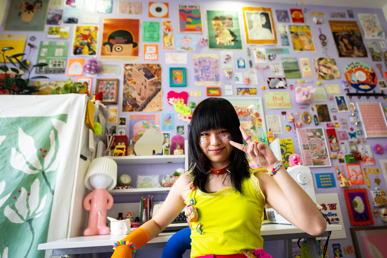
Walking into Kerru’s room, her somewhat outlandish outfit blends seamlessly into the space. It’s loud, it’s kitschy. A record player sits on top of an old TV that only displays static, placed beside an orange flower table she made out of cardboard.
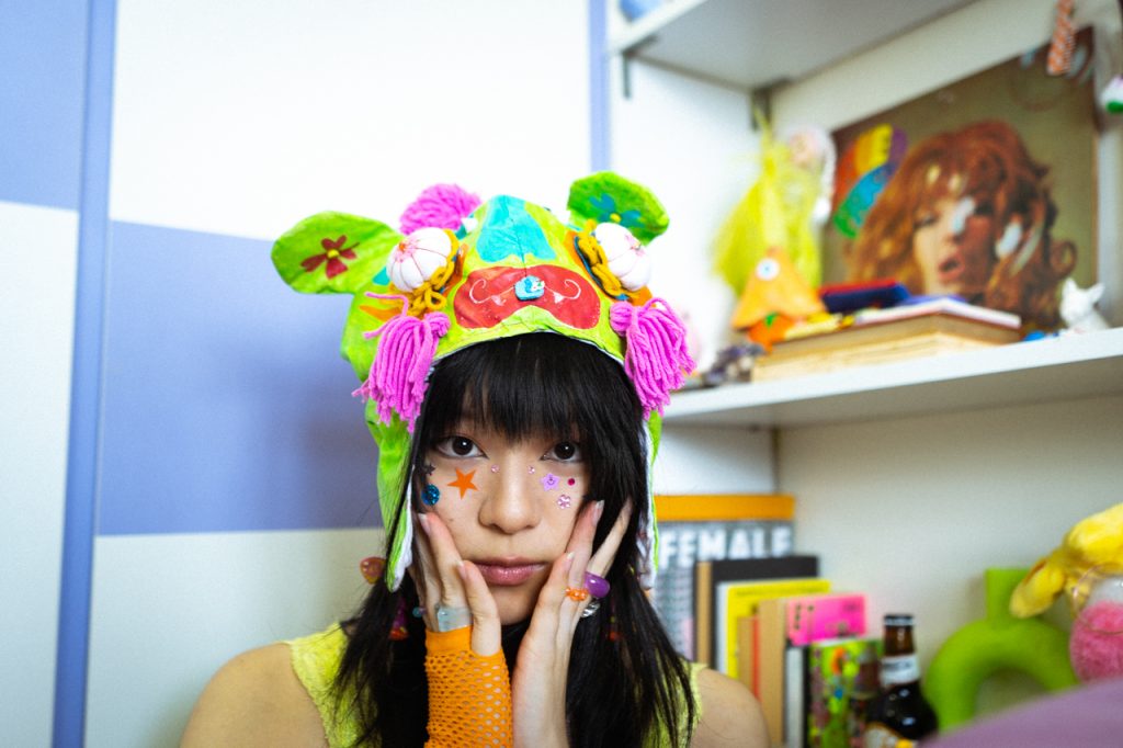
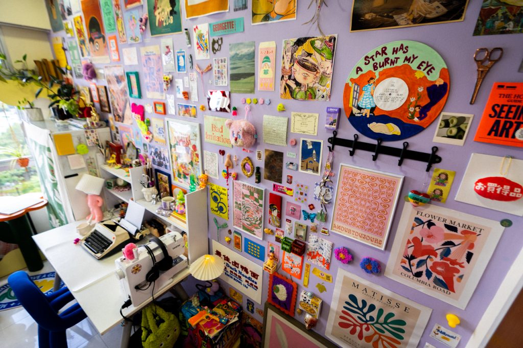
“I would describe my room as colourful, chaotic, and disorganized but not messy. Most of the stuff in this room is handmade because I don’t have much money. So, I just kind of make anything that you would buy. My room is my personality entirely.”
ADVERTISEMENT
“If you put me in a gun and splat me on a wall, this is what I imagine my insides to look like.”
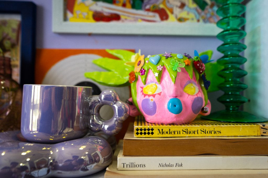
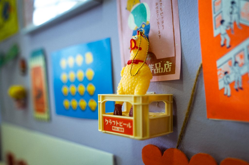
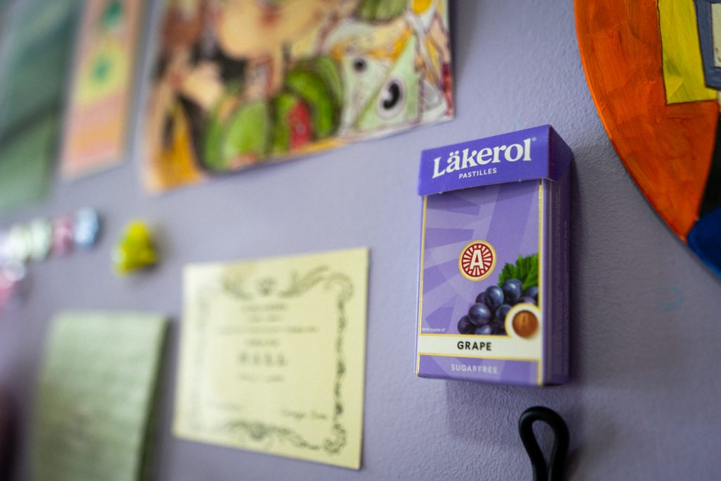
“It is clutter, but a happy clutter. For those wondering, no, no, it’s never too much. I guess you can say I love the capitalist consumerist spirit or whatever. In my room, nothing is permanent because I change a lot. So when I change, my wall changes, and god knows what will come.”
“With all the current design aesthetics, I feel it’s sad, uncolourful and bland, to me, at least. Like Kim Kardashian’s house, it’s all white inside; the sink is a slab of stone. The house has no soul. I mean, it’s nice, but it’s not for me. I need a lot of things.”
Herman Yap: The Plant Guy and Collector
A gentle mist of water spritzes in a corner as we walk past the towering staghorn ferns of all sizes in Herman’s calm oasis. Bearbrick figurines pile up in a glass jar, while neat stacks of magazines occupy select corners of his living room.
In the kitchen, a picture frame houses a dozen or so exclusive Japanese Häagen-Dazs ice cream lids, while a mural of the design lecturer’s typography of “make yourself at home” is printed on the living room walls.
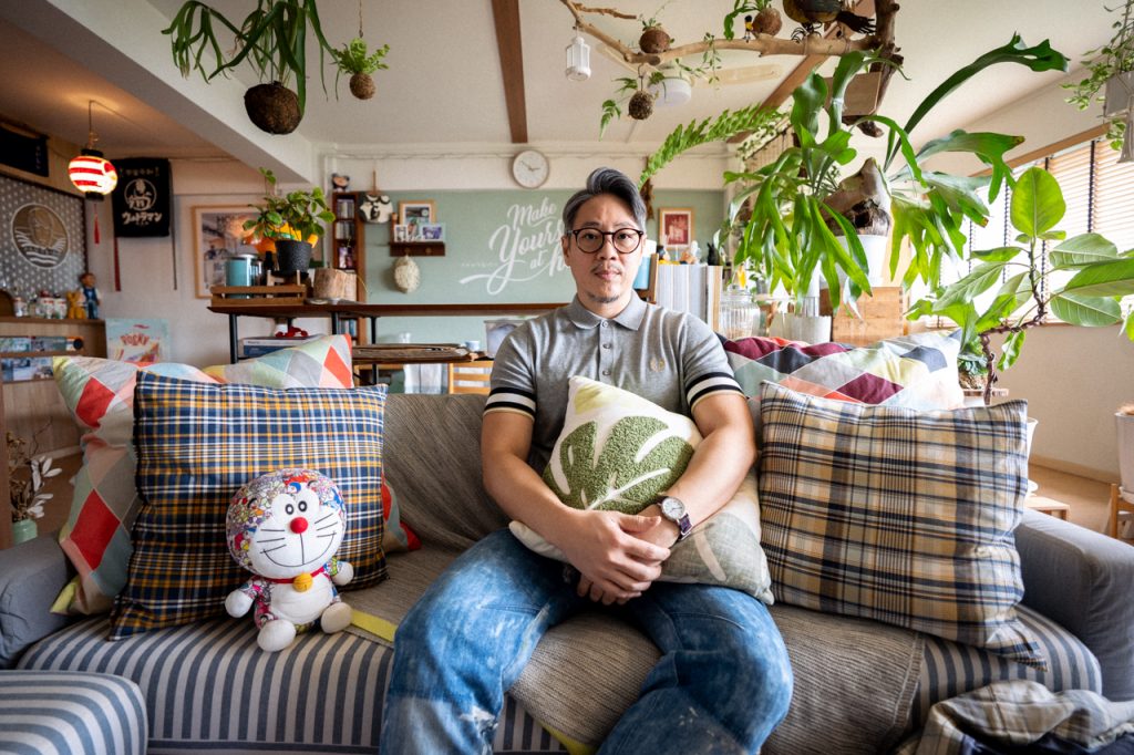
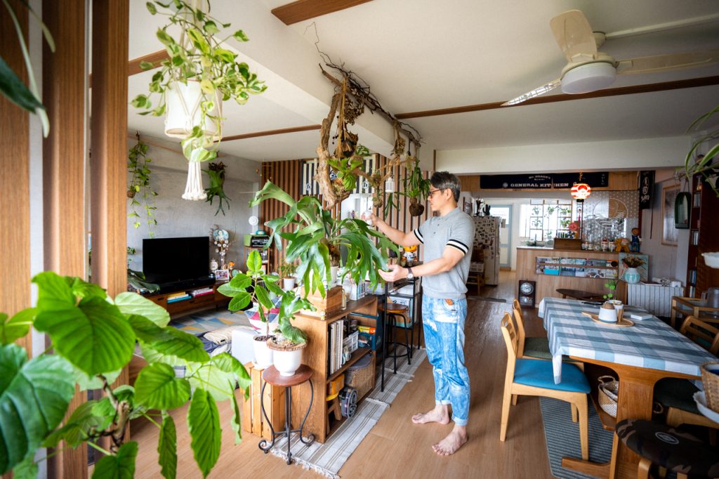
“When I started planning and designing the interiors for my home five years ago, there was no intention of following any specific trends in the market. My main goal was to put together a space where I could be comfortable and refresh the layout once in a while—hence the choice of modular furniture.“
“I was heavily inspired by the Select Shops (multi-label) I saw during my trips to Japan. I liked how they presented a variety of goods ranging from plants to kitchen wares, books to fashion, all housed in a shared space.“
“In this instance, I gave it my twist by incorporating this display approach into my home. It also fits my lifestyle, as I enjoy looking at things at a glance. The closest style, if you can call it, would be Zakka, which means miscellaneous goods that benefit one’s lifestyle.“
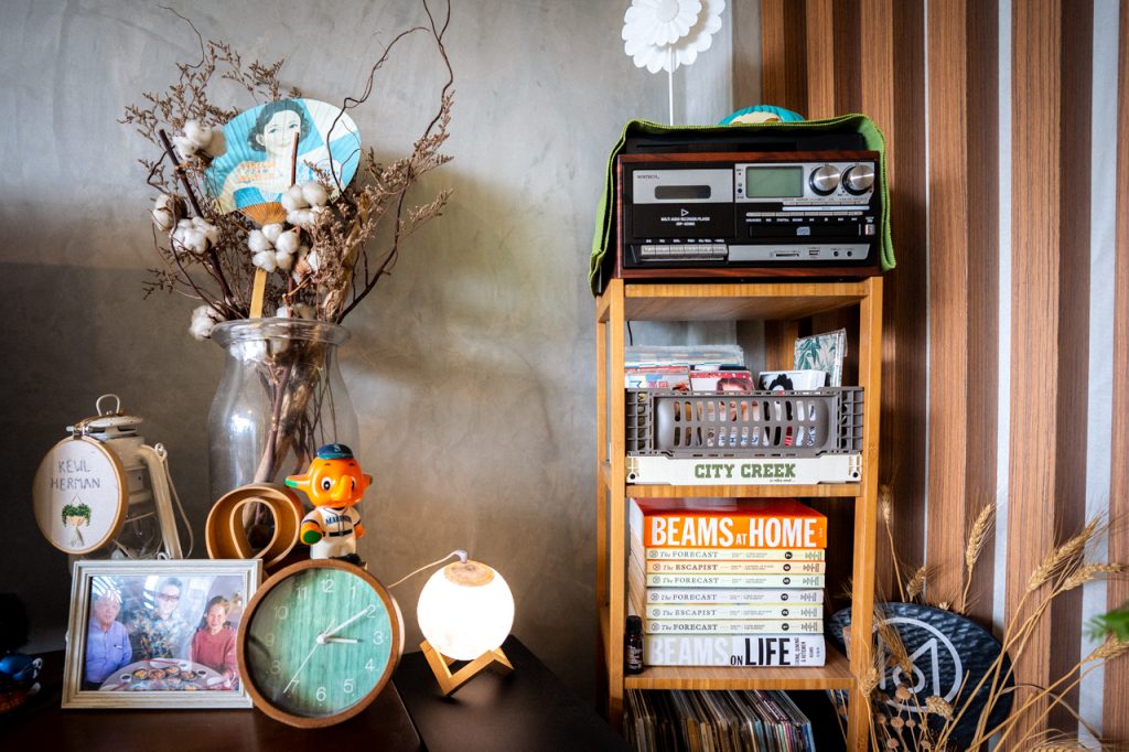
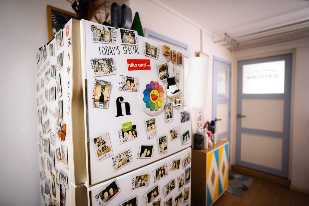
“I think there is a grey line between cluttering and hoarding, to some, my home is textbook hoarder, but to me, it’s not. I believe it is how you perceive things and strike a balance between necessity versus extravagance.“
“I feel that not all interior aesthetics are suitable for everyone, and one should not adopt them just because it is popular. That said, I do not think my home interior fits any particular market trend. I merely followed my own design instincts by gathering items that connect with me physically and emotionally.“
“What I have done now may not be relevant to me in another three years. But that’s only because our priorities change as we age, and so should our space.“
Delfina Utomo: The Stories in Things
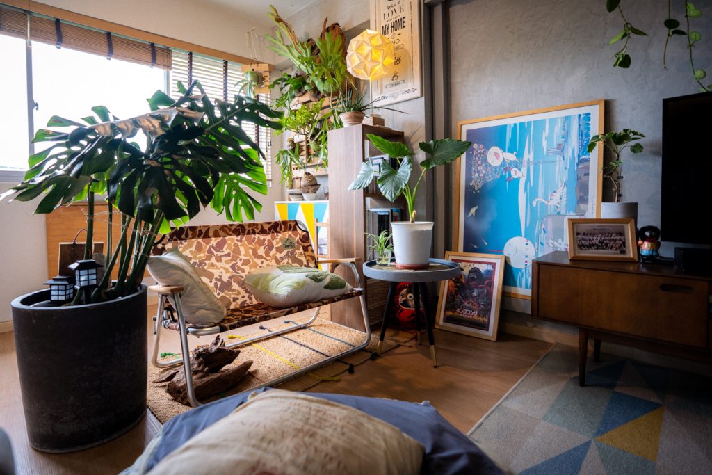
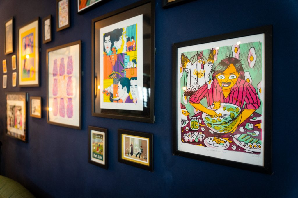
A fluffy egg cushion, a risograph of a girl furiously and monstrously scarfing down some eggs, and a chicken bag hanging from the room—there’s a theme to Delfina Utomo’s flat, but we just can’t put the finger on it.
A navy blue living room punctuated with rattan furniture and tongue-in-cheek posters is all part of the humour and heart of this managing editor’s house.
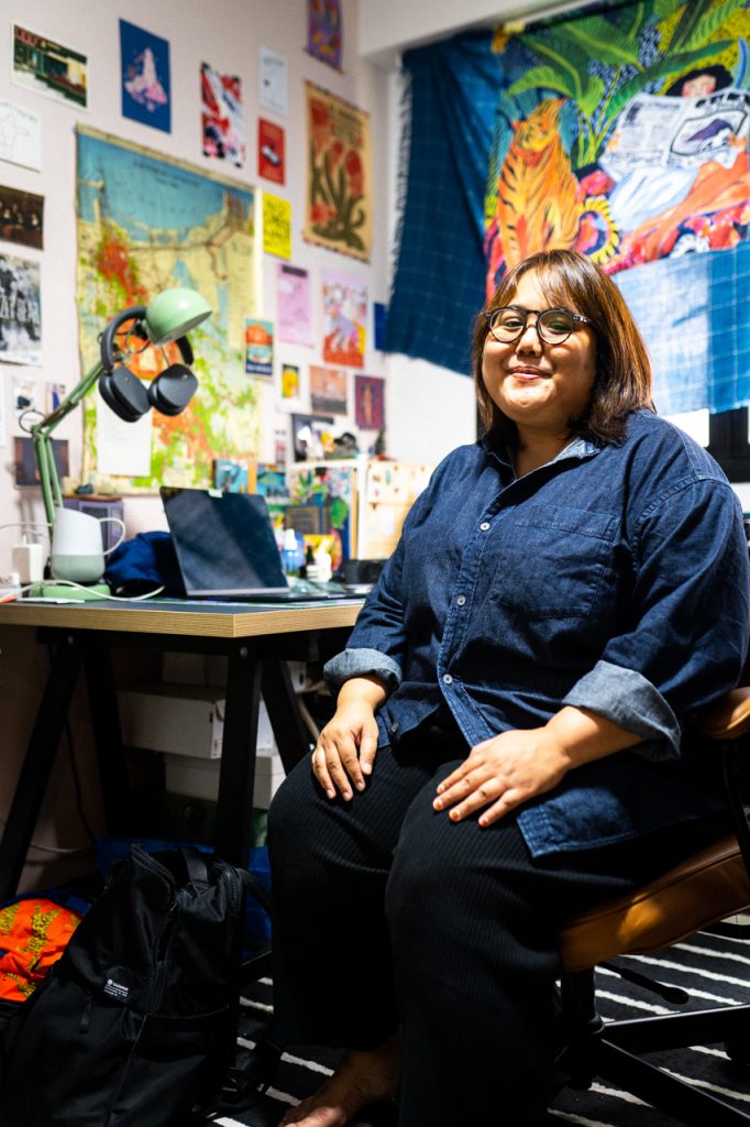
“The favourite part of my house is probably the living room and my desk, as I spend the most effort ‘cluttering up’ these areas.“
“It began organically—I didn’t follow a trend or something. I feel like all the rooms I’ve lived in have always been this aesthetic as well. I like to keep the things I like around me, which usually lends depth to a space.“
“When I was a kid, I never felt like I had a permanent space because I moved around a lot. My dad lives in Indonesia, so I spent my summers there. I never felt like I wouldn’t be staying in one place long. I always felt like having that room was my safe space.“
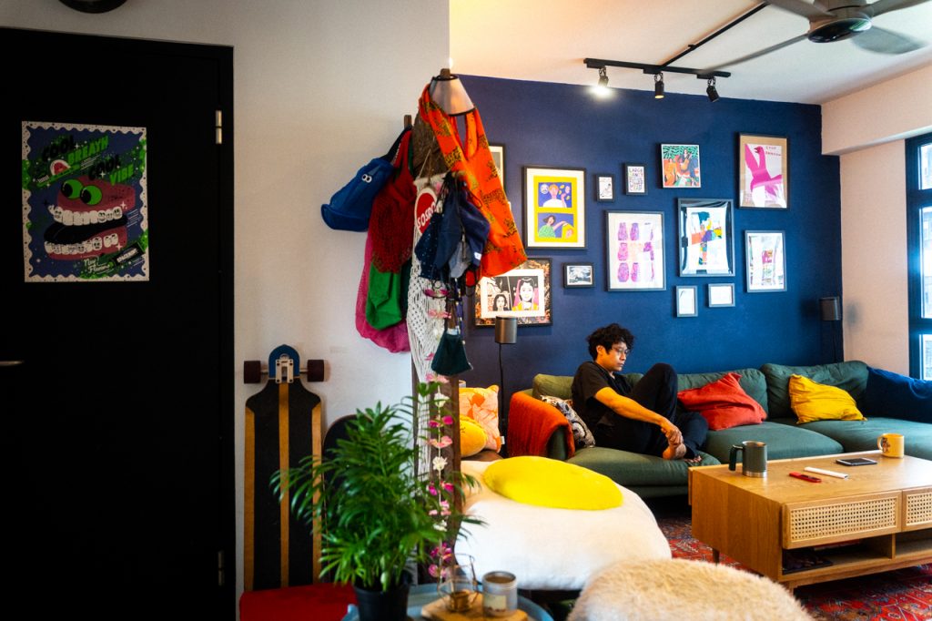
“I knew that if I had my own space, I wanted to have this gallery kind of wall. I also have pieces by David Shrigley and David Hockney—some of my favourite artists. And this neon-coloured risograph with the fabulous lady (Suzzanna Martha Frederika van Osch) with a cigarette poking out of her mouth is also cool. She is the Indonesian queen of horror, and since I’m Indonesian, I thought it was a cool homage to my heritage.“
“Then, there is this poster of the rock band American Football, which is one first few bands my husband and I bonded over. So, everything in the house is really meaningful, and everything is by design. Nothing was chosen just because of how it looks.“
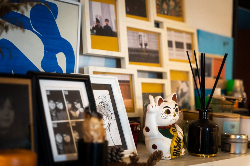
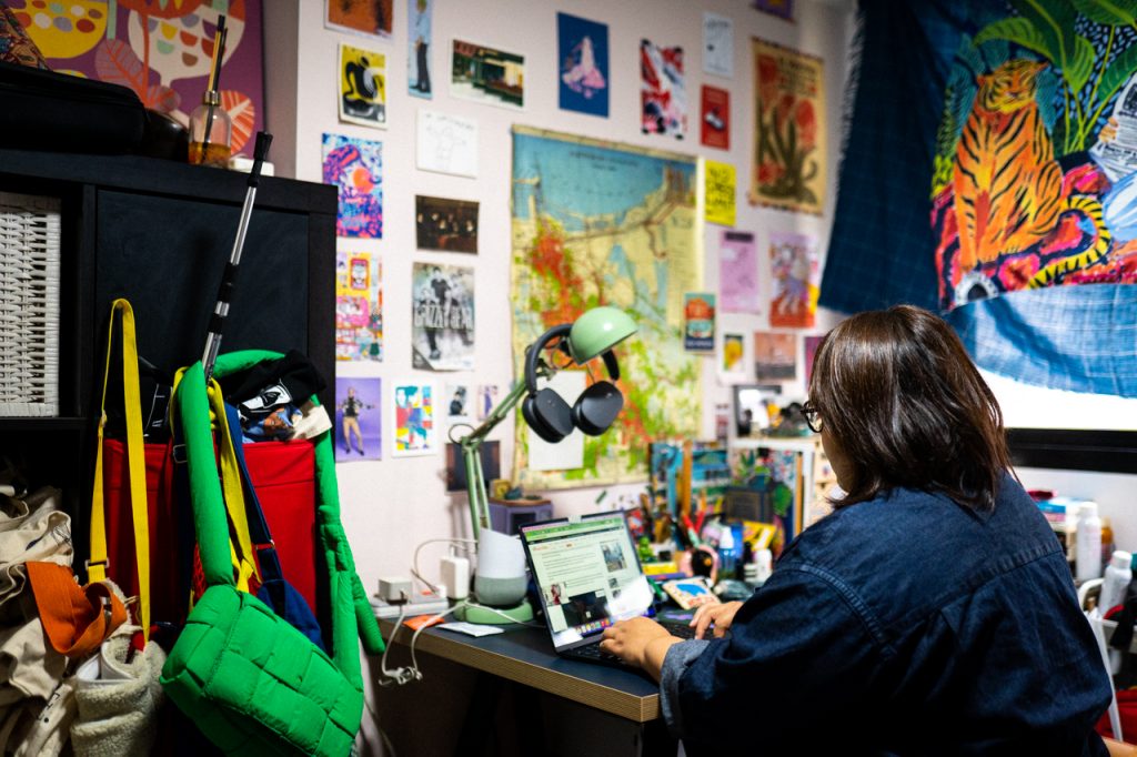
“I always say the medium is the mess when it comes to Cluttercore. I think a lot of criticism about Cluttercore is that you are spending more money, but I disagree. It’s just a lot of things I found over the years that I kept or postcards that didn’t cost much. They could be secondhand items from a thrift store, so it’s not as expensive as people think.“
“Everything I pin up is a source of inspiration for me. Whenever I look up, I’m inspired by the things I see. It forms a big part of what I can write or think about. I wouldn’t want to look at a blank wall when I’m doing work.“
