Beneath the large red Chinese letters spelling out the store’s name, is the English version, only this time, in blue.
Pictures of the dishes they serve take up any remaining available space on the signboard: Kway Chap, $4. Roasted Duck Rice, $4.50. Braised Duck Rice, $4.50. Duck Porridge, $4. Tau Kuah, $3.
Fun fact, they don’t serve Tau Kuah.
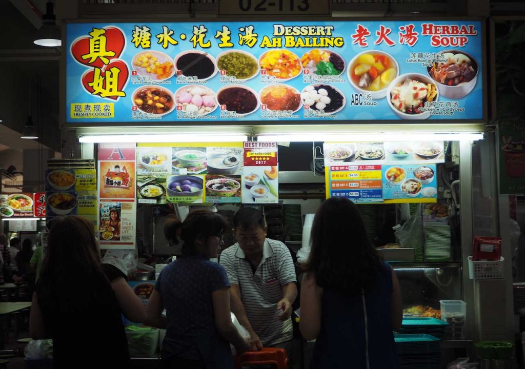
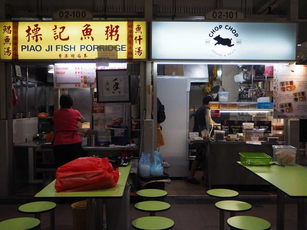
It’s a signboard that’s loud, garish, slightly misleading and more common than you think.
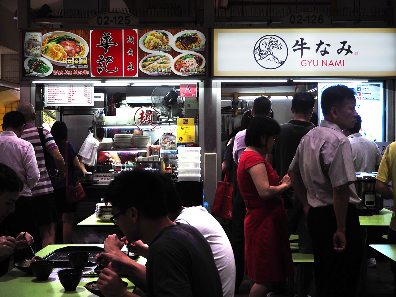
It doesn’t take much to realise that our traditional hawker signboards are probably all cut from the same cloth. In some cases, they seem to follow a template so generic that the stall doesn’t even sell the very dishes advertised on its signboard. There are even stalls that share the exact same template and colour scheme.
Granted, it’s not the most picturesque, but it does the job well enough.
“I wanted to do something different. To stand out. Something that screams out loud for attention.”
This is what Gwern Khoo, co-founder of A Noodle Story at Amoy Food Centre, set out to do when he first designed his hawker stall’s signboard 4 years ago.
“I knew I would be up against all these long-time hawkers with their queues and regular customers,” he says.
“Since the usual hawker signages are quite generic, I felt that we needed to differentiate ourselves.”
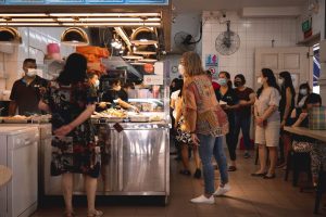
Being different has become the motto for every hawker who’s new to the trade. For one to thrive in a decades old hawker environment filled with reputable competitors and their immensely loyal fans, there is little choice but to get creative—often in more ways than one.
And so, new generations of hawkers aren’t just bringing new kinds of hawker fare to the table, they’re also breathing new life into the tried-and-true hawker stall aesthetic.
And there’s nowhere that this is more prominent than in their signboards.
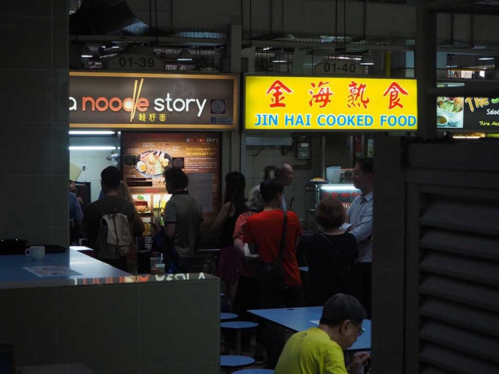
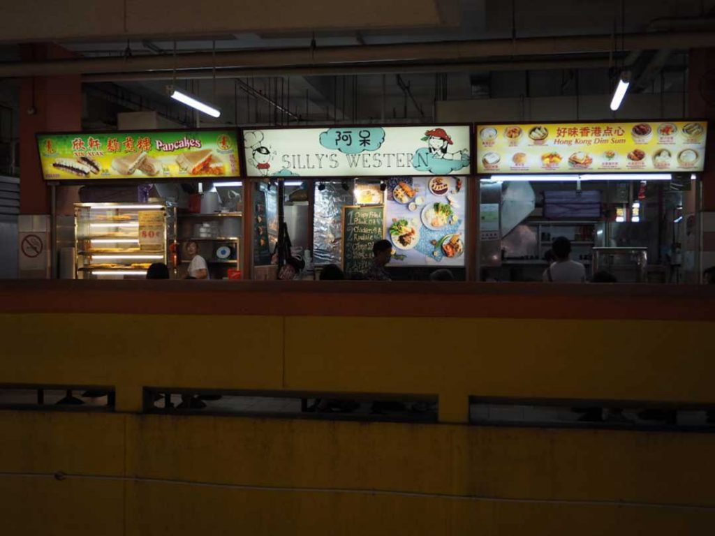
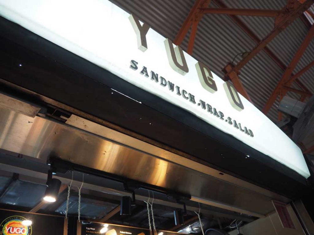
Whether they’re “big, colourful and attractive”, like A Noodle Story, or DIY-ed with a pop up effect like Yugo, a sandwich, wrap and salad store at Maxwell Food Centre, or “whimsical, cartoonish and cafe-like” like Silly’s Western at Chinatown Complex, they all manage to look effortlessly chic and minimalistic.
In fact, you could probably hang these signboards above a cafe and they wouldn’t look out of place.
Given that these stalls all reflect the aesthetic preferences of the younger generation, it probably comes as no surprise then that that’s their target audience.
“The colours, fonts, and aesthetic all matter a lot to our younger customers,” says Rahman from Yugo. “While the older generation of hawkers typically gravitates towards a standard design and menu, we want to show that we too can be innovative and creative.”
In fact, Rahman is soon looking to swap out his simple white signboard for a more vibrant, rainbow, tie-dye colour.
“It shows our customers that we’re always up for change. Not just in our menu, which we constantly update but in our look as well,” he tells me.
And given that many Yugo’s regular customers are “from the Pink Dot community”, it was also important to Rahman to show that “we don’t discriminate”.
While the signboards of older hawker tend to be more descriptive, younger hawkers are of the belief that less is more.
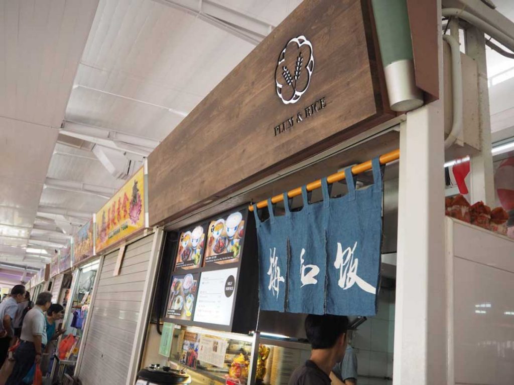
As such, some signboards like that of Plum & Rice, a Japanese fusion food stall at Bedok North, take minimalism to the extreme.
From just their signboard alone, which is wooden and bears a singular plum and rice motif, it’s impossible to tell what they’re selling. Only when you get really up close will you know what’s on offer.
Thanks to its inconspicuous design, the stall is also easy to miss. But this hasn’t worried the owners unduly, especially not when they have social media.
Thanks to the power of Instagram and Facebook, hawkers no longer have to rely solely on their signboards to attract hungry customers.
By maintaining an active Facebook and Instagram account on which details and pictures of their menu are posted and frequently updated, Plum & Rice doesn’t need a tell-all signboard; their customers already know where to find them and what they’re getting.
This frees up hawkers to get creative—or just do whatever the hell they want—with their signboards.
For Plum & Rice, this means showcasing their ideals rather than their food.
“We took inspiration from the Japanese Mon, which is similar to a coat of arms. Our Mon is of the plum blossom and rice stalk,” says Raphael, 1 of the store’s 3 co-owners.
Their choice of wood for the signboard is “Grounded in the Chinese saying, 积基树本 (jī jī shù běn): which means the basis of a tree; and 落叶归根 (luò yè guī gēn): which means a falling leaf returning to its roots.”
Together, “Our signboard exemplifies our idea of creating good food by pairing ingredients from different cultures, whilst retaining our roots.”
It’s pretty deep for just a wooden signboard but hey, their signboard, their rules.
However, I know that I’ll miss it when it’s gone.
After all, old hawker signboards are characteristic of a time before technology and social media, before cafes, fancy graphics and aesthetics were part of the equation and when simple, cheap food was all that really mattered.
But as they say, change is the only constant.
Thankfully, before those bright yellow signboards disappear completely, we still have a good few decades to go, or maybe longer, especially if more young hawkers follow in the steps of the Sai siblings.
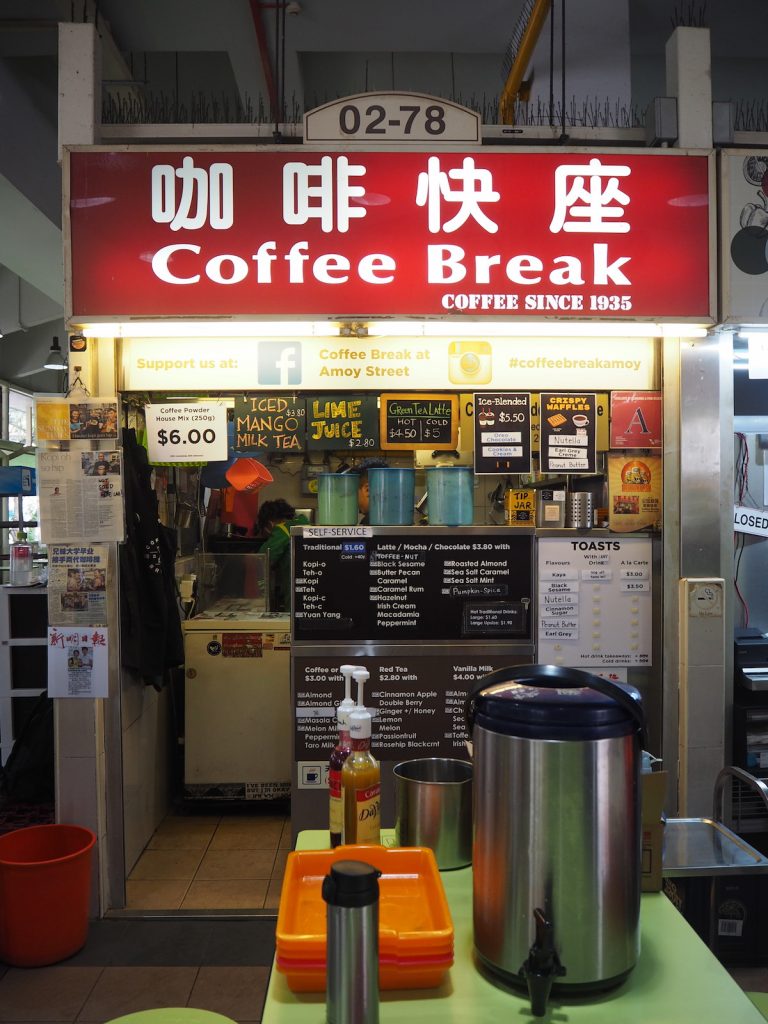
For them, the decision to keep it was instinctive. “We are essentially the beneficiaries of our late grandfather’s decision to set up a Hainanese coffee stall,” says Faye Sai, “And that’s not something we are going to forget.”
Retaining the signboard was thus their way of continuing the family legacy, one that’s been around since 1935.
Amidst all this talk of change, it’s refreshing once in awhile to see that old is after all, still gold.